Data Visualization
In this chapter we will see,
- Principles of data visualization
- The Layered grammar of graphics
- Packages: Matplotlib, Plotnine, Seaborn
The visualization of data has become increasingly prevalent. Every week the Sacramento area newspaper, the Sacramento Bee, includes a plot, data map, or table in the Data Tracker regular feature. These are dense visualizations that add credence or context to the conclusion written in the article. For example, when discussing the average cost of childcare in California the author, Phillip Reese, provides the following chloropleth map. The chloropleth map shades a geographic region based on the magnitude of a statistic, in this example, the average cost of childcare.

Chloropleth map for infant day care by county in California from [Reese]. This map is reproduced from the Sacramento Bee, https://sacbee.com.
The article could have just provided a few basic statistics, for example, the average cost of daycare in 2014 was 13,300 USD. Instead, the writer invited you to explore the data by looking at the data map. Now the data is more available for you to explore, ask your own questions, and draw your own conclusions. The most natural question is, “what is the average cost of childcare where I live?” For that the chloropleth map provides a rough answer, in Yolo county this is somewhere between 13,000 USD and 14,999 USD. You could also hypothesize that the costs are higher in the large cities, but then you might notice that Sacramento county has a relatively lower cost of childcare.
A visualization can give the user more freedom to ask their own questions from the data, but it can also contain implicit distortions of the data. In the chlorophleth map above, we might notice that most of California is one of the lightest two shades, and if we were only presented with the chloropleth map, then we may think that the average or median cost is smaller than it is. The issue with this conclusion is that the costal areas have higher population densities and so more people are incuring higher costs of childcare than the map suggests. Our eyes were implicitely estimating the average cost by surface area of the county, when we are really interested in the average cost by population. The population is not presented here, and so we are left relying on our knowledge of California demographics to draw many of our conclusions. In this chapter, we will discuss some of these issues and what constitutes excellence in data visualization.
Deconstructing the simple plot
Your first encounter with data visualization was probably on a plot by plot basis. You were presented with a scatterplot, histogram, time series plot, chloropleth map, etc. It is our goal to move away from named plots that perform a specific task, and to understand the elements of visualizations by deconstructing our favorite plots. This process culminated in the development of the grammar of graphics [Wilkinson] and the layered grammar of graphics [Wickham]. We will see that this is the best way to understand the design of the Plotnine package, and to a lesser extent Matplotlib.
The word grammar evokes language, but it is a general term for principles and rules by which we combine abstract elements, such as graphical components. Hopefully, if our grammar is useful, it will suggest certain graphics for data visualization and tell us when a graphic is non-sense. We will adopt the layered grammar of graphics introduced in [Wickham]. In order to motivate this grammar, let’s begin by deconstructing a scatterplot.
In 1929, Edwin Hubble published a paper with a scatterplot that would change our understanding of the universe. To get to this plot, Hubble had to perform a painstaking analysis of the galactic nebulae to obtain something that is known as redshift. According to special relativity, if a galaxy is moving away from you then the wavelengths of the light emitted from that galaxy will be observed to be longer, making the galaxy appear more red than it would be if it was relatively motionless. This allowed Hubble to estimate the velocity of the galaxy relative to earth. Hubble also was able to estimate the galaxies’s distances from Earth to produce the following plot,

Hubble’s original scatterplot demonstrating the expansion of the universe [Hubble], image from the Proceedings of the National Academy of Sciences.
There is a fairly clear linear trend between the distance (X-axis) and the velocity (Y-axis) of the galaxy. This indicates that further away galaxies are moving faster, which was the first evidence that the universe is expanding.
We can separate out a graphic into three basic components:
- geometric objects,
- scales and coordinate systems,
- annotation for the plot.
In Hubble’s plot the data points and regression lines are all geometric objects, the scales and coordinate systems are represented by the guide lines and ticks, and the annotation is the axis labels. Geometric objects can be points (as in a scatter plot), lines (as in regression line), or polygons (as in the counties in the chloropleth map). These objects have various aesthetics, such as the position of a point or the width of a line.
One plot may have many layers with different layers containing different geometric objects. In the plot above, in addition to the point data, Hubble plotted a fitted regression line with 0 intercept (solid black). This is another geometric object, and it is based on a statistic, the regression line. The circles in the plot are the averages of the data grouped by the galaxy type, and the dotted line is the corresponding regression line. The only aesthetic elements in this plot are the positions of the points and the slope of the line.
A scale will map the data to the aesthetics. You are probably familiar with the scale modifying the position as in choosing the log scale. A scale is common to all of the layers so that layers will not conflict when they are overlayed. Hubble’s visualization presents the axes with a simple linear scale. This was by no means the only choice, and we can change the scale of either axis (to a log-scale for example). Implicitely, this plot uses the Cartesian coordinate system; a coordinate system determines the position of the geometric objects on the plot. We could also choose for example a semi-log coordinate system.
We have introduced the following terms in this section,
- geometric objects,
- layers,
- scales, and
- coordinate system.
We will go over another aspect called faceting as well when we go through the use of Plotnine. For the moment, let’s learn some basics of Matplotlib and how to build a plot.
Matplotlib
You should think of Matplotlib as a powerful low level package for drawing and plotting in Python. Pretty much anything that you may want to do regarding 2D plotting (and some 3D) can be done with Matplotlib. Within Matplotlib you have the Pyplot module, which is a high level tool for producing the named plots, such as the histogram, scatterplot, and barplot. Pyplot gives you tools to modify the figure in predictable ways such as add a legend. Hence, Matplotlib is either good for making highly customized figures, or with pyplot by doing very standard predictable visualization, but does not have a layer of abstraction that is somewhere in the middle. This is because it is not designed to follow a grammar, and for that we will use Plotnine.
So have probably seen plotting in R, matlab, excel, etc. Matplotlib is the
most extensive Python package for plotting, created by the late John
Hunter, and it is compatible with Numpy and Pandas. It has extensive 2D
plotting functions, some 3D plotting, and extensions for geographical
data. The 2D plots
that we commonly make are in Pyplot:
plot, scatter, hist, bar, pie, boxplot, contours. You can also draw
basic objects on the plot, like lines, polygons, etc. but we won’t be
going over this in this book.
Matplotlib provides all of the objects needed to plot and customize complicated figures, including adding text, polygons, axes, lines, etc. Base Matplotlib is very low level in the sense that you have very fine control over the inner workings of the plot itself. This is in contrast to packages and modules like Plotnine, Pyplot, and Seaborn, which are high level, and can provide quick, beautiful graphics by assuming that you will be performing certain operations. We will talk about these later in the chapter, but first, we should introduce matplotlib because it can do pretty much everything when it comes to static plotting.
While Matplotlib provides all of the objects that are used to build a plot, Pyplot
provides a simpler interface that uses matplotlib objects behind the
scenes. For example, the object matplotlib.axes.Axes is what we
think of as the plot - which is where all of the lines, points, etc. are
drawn. We can remain ignorant of this object and its inner workings by
using Pyplot which will create an instance of this object when we call
pyplot.figure() (in fact the return value of this function is a
figure and axes instance). Consider the following code…
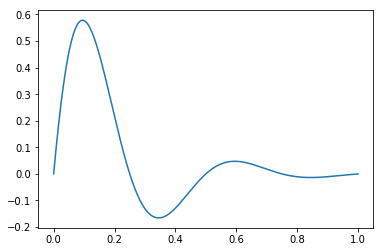
import numpy as np
import matplotlib.pyplot as plt

x = np.linspace(0, 1, 500)
y = np.sin(4 * np.pi * x) * np.exp(-5 * x)

plt.plot(x, y)
plt.show()
In order to do something more customized you may need to act on the
Axes instances directly. For example, the fill and grid
methods are ways to add fill to the lines above and gridlines. This
example can be found
here.
fig, ax = plt.subplots()
ax.set_title("Fill under the curves") # set title
ax.grid(True) # create gridlines
ax.fill(x, y) # Fill under the curves
plt.show()
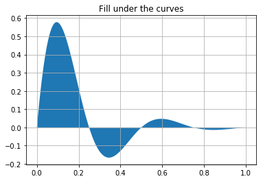
Above we initialized Figure and Axes objects with the subplots
method called fig,ax respectively. We can create a plot using these
objects and their class methods. The Figure instance is a container for
everything that will be plot at this time, which includes possibly
multiple plots. For a given plot, the Axes object holds everything
including the geometric objects, annotations, and the scales and
coordinate system. The Axes object allows us to make plots using class
methods, as in the fill method which creates a polygon that fills
the area between the curve and the X-axis. Consider the following plots.
fig, ax = plt.subplots(1,2,figsize=(10,3))

ax[0].plot(x,y) # plot on the first axis

patches = ax[1].fill(x, y) # fill on the second
pat = patches[0] # isolate the polygon
pat.set_alpha(0.2) # set the alpha - transparency
ax[1].grid(True) # add grid lines
ax[1].set_xscale('log') # set the scale of the x-axis
plt.show()
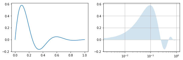
type(fig), type(ax[0]), type(pat)
(matplotlib.figure.Figure,
 matplotlib.axes._subplots.AxesSubplot,
 matplotlib.patches.Polygon)
We created two Axes objects in the container ax. On one we simply
use the plot and on the other the fill method is used. The name
Axes is confusing because it is does not refer to each individual axis,
but the entire plot. The Axes objects have associated XAxis and YAxis
objects. Nevertheless, if you want to work on an axis then you need to
act on the Axes object as in set_xscale.
We also isolated the polygon itself, which is a Polygon object. The Polygon inherits from the Patch which inherits from the Artist object (Inheritance means that Polygon inherits the methods and attributes of Artist). Artists in Matplotlib are all of the geometric objects in a plot. These can be added to an Axes object to build highly customized plots, and at its core Matplotlib is a drawing tool.
The basic objects in matplotlib are,
- Figure: this contains everything that gets plotted; it has children axes, which can be subfigures, the title, and the details of how the plot is actually printed.
- Axes: this is where the individual plots lives; it contains each axis and annotations.
- Artist: the geometric objects that are drawn on the plot.
Typically, you will use Pyplot to make common plots without directly working on the Figure and Axes objects. You can see a list of methods in Pyplot to see what is available. You can find details about the object oriented API (the use of Figure, Axes, Artist etc.) in the API documentation.
Grammar of graphics
We have introduced some elements of the layered grammar of graphics introduced in Wickham. As of October 2018, the best package that implements this framework in Python 3 is the Plotnine package. Plotnine follows the syntax of the ggplot2 package in R (https://ggplot2.tidyverse.org/), so much so that the documentation for Plotnine often refers to the documentation of ggplot2. You can find the Plotnine documentation in (https://plotnine.readthedocs.io) which is quite extensive.
You can initialize a plot with the p9.ggplot (or the p9.qplot
for a quick version). When you initialize the plot, you specify the
data. The variables in this data can be used in aesthetic mappings as in
“the X-axis position is a linear function of the height variable”. After
this we can modify annotations, such as the title and X-axis labels, and
add geometric elements (geoms for short), statistical transformations,
and scales. We can also apply faceting, modify coordinate systems, and
add position adjustments. Furthermore, these elements can be grouped
into layers that can be modified separately.
Throughout this section, we will work with the U.S. College Scorecard data. You can find the complete analysis of this dataset in the case study chapter. The raw dataset contains thousands of variables for each U.S. college, but we will focus on only a handful. This includes the undergraduate enrollment, the tuition, highest degree awarded, and the mean earnings for graduates 10 years after their degree.
col_large.head()
| Year | OPEID | OPEID6 | INSTNM | CITY | STABBR | ZIP | MAIN | NUMBRANCH | PREDDEG | ... | CONTROL | ST_FIPS | REGION | ADM_RATE | UGDS | TUITIONFEE_IN | TUITIONFEE_OUT | MN_EARN_WNE_P10 | ICLEVEL | YearDT | |
|---|---|---|---|---|---|---|---|---|---|---|---|---|---|---|---|---|---|---|---|---|---|
| UNITID | |||||||||||||||||||||
| 100636 | 1997 | 01230800 | 12308.0 | Community College of the Air Force | Montgomery | AL | 36114-3011 | 1.0 | 1.0 | 2.0 | ... | 1.0 | 1.0 | 0.0 | NaN | 44141.0 | NaN | NaN | NaN | 2.0 | 1997-01-01 |
| 100654 | 1997 | 00100200 | 1002.0 | Alabama A & M University | Normal | AL | 35762 | 1.0 | 1.0 | 3.0 | ... | 1.0 | 1.0 | 5.0 | NaN | 3852.0 | NaN | NaN | NaN | 1.0 | 1997-01-01 |
| 100663 | 1997 | 00105200 | 1052.0 | University of Alabama at Birmingham | Birmingham | AL | 35294-0110 | 1.0 | 2.0 | 3.0 | ... | 1.0 | 1.0 | 5.0 | NaN | 9889.0 | NaN | NaN | NaN | 1.0 | 1997-01-01 |
| 100706 | 1997 | 00105500 | 1055.0 | University of Alabama in Huntsville | Huntsville | AL | 35899 | 1.0 | 1.0 | 3.0 | ... | 1.0 | 1.0 | 5.0 | NaN | 3854.0 | NaN | NaN | NaN | 1.0 | 1997-01-01 |
| 100724 | 1997 | 00100500 | 1005.0 | Alabama State University | Montgomery | AL | 36104-0271 | 1.0 | 1.0 | 3.0 | ... | 1.0 | 1.0 | 5.0 | NaN | 4679.0 | NaN | NaN | NaN | 1.0 | 1997-01-01 |
5 rows × 21 columns
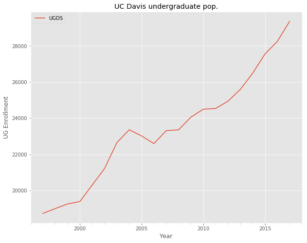
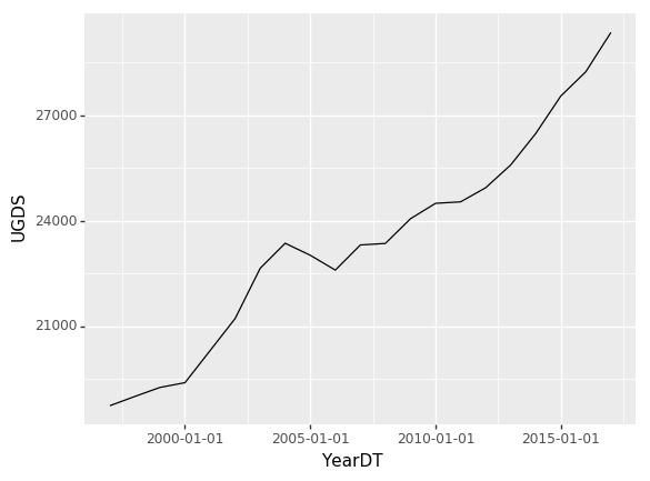
We have isolated the data for UC Davis, and would like to plot the undergraduate enrollment over time. We can use Pandas and Matplotlib to plot this as in the script below.
ax = davis.plot(y='UGDS')
ax.set_title('UC Davis undergraduate pop.')
ax.set_ylabel('UG Enrollment')
plt.show()
Plotnine also has trouble dealing with Period data, so let’s convert it to a timestamp. This will create the illusion that the yearly data corresponds to a specific time, on Jan 1st.
davis['YearDT'] = davis.index.to_timestamp()
We initialize the ggplot with p9.ggplot specifying the data and the
aesthetic mapping for the positions for X and Y axes. Finally, we add
the line geom.
p9.ggplot(davis,p9.aes(x='YearDT',y='UGDS')) \
+ p9.geom_line() # first layer
Breaking this down, we have specified that the variable YearDT is mapped to the X position and UGDS is mapped to the Y position. That way when we add the line geom it knows what variables are associated with the positions of the line.
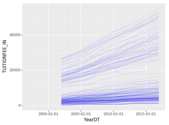
We will compare the rise in tuitions between universities by looking at
the tuition as a function of school year. We will work with a subsampled
dataset, col_samp that has roughly 10% of the original number of
rows (you can see this in the Case Study chapter).
Adding basic elements: data, geoms, aesthesic mappings
Plotnine allows us to define the individual elements of a plot. This
starts with a data and the aesthetic elements, such as the X-axis,
Y-axis, and grouping variables. The following adds a line geom layer.
The grouping tells Plotnine that the lines should be plotted for each
university separately. In the statement below we add p9.aes instead
of specifying it as an argument.
p9.ggplot(col_samp.reset_index()) \
+ p9.aes('YearDT','TUITIONFEE_IN',group='UNITID') \
+ p9.geom_line(alpha=.1,color='b')
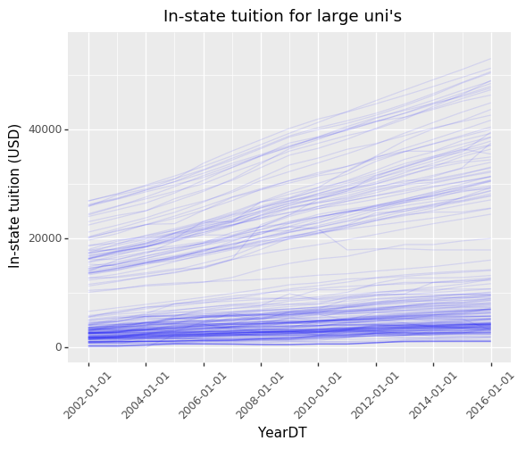
In the plot below we add some annotations, such as the y-label. We can
further modify the annotations by rotating the X-axis text (we do this
with p9.theme()) and setting the X limits. In Plotnine annotations
are modified through themes and labels as in the following.
p9.ggplot(col_samp.reset_index()) \
+ p9.aes('YearDT','TUITIONFEE_IN',group='UNITID') \
+ p9.geom_line(alpha=.1,color='b') + p9.scale_x_date(limits=['2002','2016']) \
+ p9.theme(axis_text_x = p9.themes.element_text(rotation=45)) \
+ p9.labels.ggtitle("In-state tuition for large uni's") \
+ p9.labels.ylab('In-state tuition (USD)') # added annotations
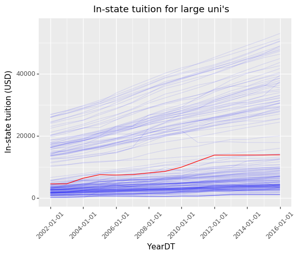
Layers
The layered grammar of graphics allows for multiple layers, with one default layer. Each layer contains a geometric object, statistical transformation, and possibly a position adjustment. The layer can inherit the dataset and aesthetic mappings from the default layer, or it may have its own. This significantly adds flexibility to the grammar. Because Plotnine follows the layered grammar of graphics, each geom or stat creates a new layer. Layers can be very convenient since we can add additional layers that are based off of possibly different data or aesthetic mappings.
In the following plot we added the UC Davis line geom to the plot as a
new layer. If we did not specify the data to be the davis DataFrame,
then we would not have so easily isolated the UC Davis data.
p9.ggplot(col_samp.reset_index()) \
+ p9.aes('YearDT','TUITIONFEE_IN',group='UNITID') \
+ p9.geom_line(alpha=.1,color='b') + p9.scale_x_date(limits=['2002','2016']) \
+ p9.theme(axis_text_x = p9.themes.element_text(rotation=45)) \
+ p9.labels.ggtitle("In-state tuition for large uni's") \
+ p9.labels.ylab('In-state tuition (USD)') \
+ p9.geom_line(data=davis,color='r') # new layer!
Facetting
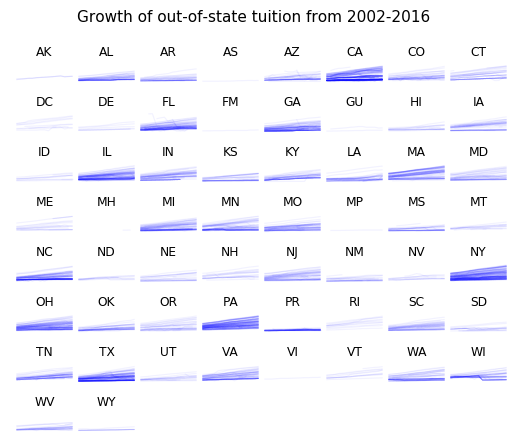
We can also group by a variable or equation, then create new plots for each subset of the data. This process of grouping on a variable to create multiple plots is called facetting. In the figure below we facet on the State, which means that we will produce a tuition v. year plot for every state. This will create many plots, so we adopt a minimalist theme (called void) and shrink the size of each plot.
p9.ggplot(col_large.reset_index()) \
+ p9.aes('YearDT','TUITIONFEE_OUT',group='UNITID') \
+ p9.geom_line(alpha=.05,color='b') + p9.scale_x_date(limits=['2002','2016']) \
+ p9.theme_void() + p9.labels.ggtitle("Growth of out-of-state tuition from 2002-2016") \
+ p9.facet_wrap('~ STABBR',ncol=8)
Statistical transformations
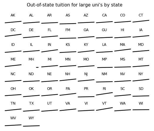
Where do statistical transformations fit in to the grammar of graphics and why include them at all in our grammar? Statistical transformations take the data as input and outputs new data that we can now draw with. Including these transformations in the grammar makes it possible to have the transformation be dependent on aspects of the current plot. For example, if we specify a new coordinate system such as log-log then the smoother can know to act on the scaled data.
Another example of this principle is what happens when you combine stats
with facets. In the figure below, we plot trend lines for each state.
This produces an interesting plot that lets us quickly compare the OLS
fit to each state. When we create the stat, with p9.stat_smooth we
did not have to specify to only apply it to the group for a given state,
it knew to do this because of the facetting. It would not make sense to
apply the stat to the full dataset and then plot the grouped fitted
tuition.
p9.ggplot(col_large.reset_index()) \
+ p9.aes('YearDT','TUITIONFEE_OUT',group='STABBR') \
+ p9.scale_x_date(limits=['2002','2016']) \
+ p9.facet_wrap('~ STABBR',ncol=8) \
+ p9.stat_smooth(method='lm') \
+ p9.theme_void() \
+ p9.labels.ggtitle("Out-of-state tuition for large uni's by state")
Scales
Recall that an aesthetic attribute is a property of a geom such as
color, size, or position. An aesthetic mapping is a function from the
data to that attribute. We can add color and size by including the
aesthetic mapping. In the example below, we make color and size
functions of the undergraduate enrollment (UGDS) by specifying
size='UGDS',color='UGDS'.
This mapping from data to aesthetic attribute is controlled by the scale. For example, the X-variable can undergo a log transformation to determine the X position in the plot. This gives the X-axis a log scale for the plot. The concept is very general, and can be applied to the color or size as well.
In the code block below, color and size are given scales, using
p9.scale_color_cmap() and p9.scale_size_area() respectively. A
colormap is a term for how the variable is translated into RGB values,
i.e. how do we translate the number .5 into a color. (An RGB value
is a triplet that specifies the red, green, and blue content of the
pixel.) In the code below this is specified in the cmap argument.
This example is applied to the 2013 data, which we store in the DataFrame col_2013.
All Matplotlib colormaps are available for use in Plotnine:
https://matplotlib.org/users/colormaps.html
p9.ggplot(col_2013) + p9.aes('TUITIONFEE_IN','MN_EARN_WNE_P10',size='UGDS',color='UGDS')\
+ p9.scale_size_area(breaks=[10000,20000,40000]) \
+ p9.labels.ggtitle("Mean earnings as a function of in-state tuition") \
+ p9.geom_point(alpha=.5) + p9.scale_color_cmap('plasma',guide=False)
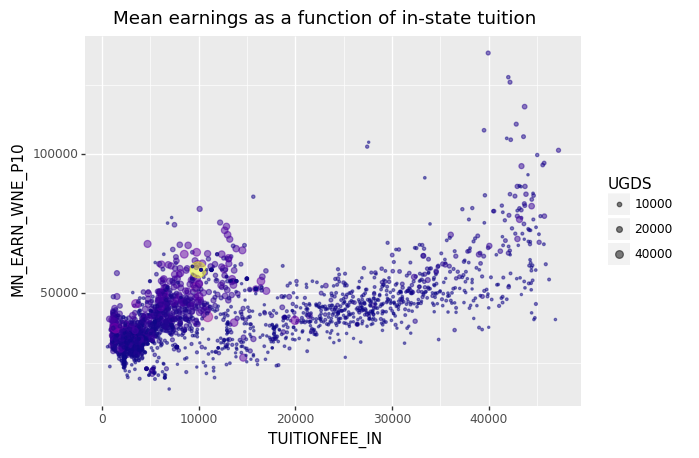
In the above plot, the size scale is set such that the area of the point is proportional to the UGDS variable. It is also possible to set the scale such that the radius is a linear function of this variable in Plotnine. However, this will violate an important rule of graphical integrity: the graphic should have no distortions of the data. Human vision implicitely measures quantity by the area of an circle, not by the radius. If we used the radius in our scale, the areas would be proportionate to the square of the UGDS variable. The integrity of our graphic would suffer as a consequence. Also, a design choice was to make the larger universities have a lighter color.
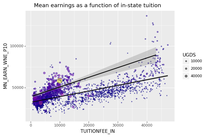
We can also add linear regression lines to the plot. We added groups
with a formula, UGDS > 20000, which means that the stats are
computed for each group. The result is two regression lines for the
largest universities and every other university.
p9.ggplot(col_2013) + p9.aes('TUITIONFEE_IN','MN_EARN_WNE_P10',size='UGDS',
                             color='UGDS',groups='UGDS > 20000')\
+ p9.scale_size_area(breaks=[10000,20000,40000]) \
+ p9.labels.ggtitle("Mean earnings as a function of in-state tuition") \
+ p9.geom_point(alpha=.5) + p9.stat_smooth(show_legend=False) + p9.scale_color_cmap('plasma',guide=False)
Moving forward
We can see how flexible our grammar of graphics is by making some very
different graphics in the same framework. We can for example, apply a
density geom which plots a density estimate that by default uses a
kernel density estimate in Plotnine. (For now, kernel density estimation
should be thought of as a smooth version of the histogram.) We can map
another variable HIGHDEG to the fill color aesthetic attribute of the
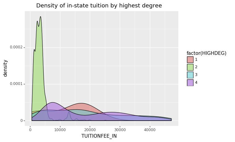
density geom, making the color change for each value of HIGHDEG.
HIGHDEG corresponds to the highest degree granted by the college.
We also remove some missingness and store the resulting DataFrame as col_2013_nna.
p9.ggplot(col_2013_nna) + p9.aes('TUITIONFEE_IN',fill='factor(HIGHDEG)') \
+ p9.geom_density(alpha=.5) + p9.labels.ggtitle('Density of in-state tuition by highest degree')
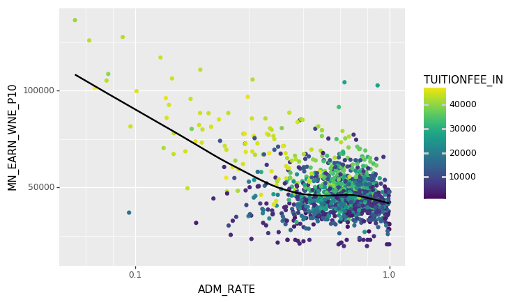
We can also get a sense of the influence of admissions rate (ADM_RATE) on the mean earnings. We will use a point geom to get a scatterplot. We will also add a lowess smoother layer to get a sense of the trend. (LOWESS is a non-parametric smoother that locally averages neighboring points to make a trend line.) Because ADM_RATE is concentrated around 1 it makes sense to use a log-scale for the X axis. This does not change the axis text but does change the position of the point geoms. We also add a color aesthetic element for in-state tuition.
Notice that the log-scale does not change the values of the X-axis text, just where they fall in the X-axis. It also modifies the coordinate system, making the grid lines fall in an irregular fashion.
p9.ggplot(col_2013_nna) + p9.aes('ADM_RATE','MN_EARN_WNE_P10',color='TUITIONFEE_IN') \
+ p9.geom_point() + p9.scale_x_log10() \
+ p9.scale_color_cmap() + p9.stat_smooth(method='lowess')
Other named plots in python
We have already seen the use of the Pyplot API for making named plots with matplotlib. While the grammar of graphics provides a systematic way to make most plots, it is often faster to use an interface that have predefined plots. Seaborn is another Python package that provides many more named plots than Pyplot. We will not go over most of these, but you can see a few in the following examples. You can find the Seaborn documentation and examples here: https://seaborn.pydata.org/
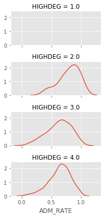
For example the sns.Facetgrid will facet on one or two variables and
make a grid of plots, in this case we plot the density of the admission
rate. (Apparently there is not enough admissions data for
HIGHDEG = 1.)
import seaborn as sns
g = sns.FacetGrid(col_2013_nna,row='HIGHDEG',aspect=2, height=1.5)
sfig = g.map(sns.kdeplot,'ADM_RATE')
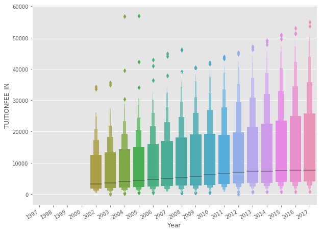
Another interesting named plot is the boxenplot that will produce vertical histograms of the Y variable with variable bin widths by grouping on the X variable. The following is another look at the in-state tuition by year.
g = sns.boxenplot(x='Year',y='TUITIONFEE_IN',data=col_large)
g.format_xdata = mpl.dates.DateFormatter('%Y-%m-%d')
g.figure.autofmt_xdate()
Excellence and Integrity in Graphics
We have seen both the strengths and perils of data visualization. With the chloropleth map at the beginning of the chapter, we saw how showing the data envited the reader to ask their own questions of the data, such as “What is the cost of raising a child in my county?”. But we also have to be aware that visualization will implicitely convey statistics. For example, the chloropleth map under expresses the overall cost of infant care for the average Californian, since people tend to be concentrated in large cities. When a visualization exhibits graphical excellence, then it can provide the viewer with a more complete picture of the data. A graphic may also lack graphical integrity, and may in fact distort the data.
Data visualizations may have many advantageous properties. They can present many numbers in a way that is meaningful to the viewer. Think of two extremes: the descriptive statistic and the data table. When we look at the raw values in a DataFrame as in,
| TUITIONFEE_IN | MN_EARN_WNE_P10 | |
|---|---|---|
| UNITID | ||
| 100654 | 7182.0 | 35000.0 |
| 100663 | 6798.0 | 46300.0 |
| 100706 | 8794.0 | 50400.0 |
| 100724 | 7932.0 | 29400.0 |
| 100751 | 9200.0 | 48600.0 |
We can rarely see any meaningful patterns this way because our brains are not designed to process tabular data (not to mention the fact that there are 2562 rows in this DataFrame). If you knew precisely what statistics were interesting then you could calculate and report that. For example, the correlation between the variables TUITIONFEE_IN and MN_EARN_WNE_P10 is 0.64. You might conclude that there is a dependence between these variables. But by looking at the scatterplot (above) you can find that there is a much more complicated relationship between these two variables and the UGDS variable. This leads us to a much richer understanding of the population as a whole.
Aside from showing many numbers painlessly and inviting the viewer to explore the data, there are some things that good graphics do not do. Specifically, they do not distort the data, they do not provide unnecessary decoration, and the viewer should be able to focus on the data itself without being distracted by the visualization method itself. Distortion can come in many forms, some implicit and some explicit. Explicit distortion can be applying a scale transformation, but not making this apparent in the plot, such as using the un-scaled coordinate system. Often explicit distortion is difficult to do on accident, such as mislabelling the axis ticks.
Implicit distortion is often easy to miss but can have serious consequences. One common form of such distortion is a mismatch between the size of the effect in the graphics and the size of the effect in the data. [Tufte] calls the ratio between these the lie factor for a graphic. For example, in our scatterplots, the aesthetic mappings to the size of a point geom used the area to calculate the scale. This means that the variable was proportional to the area of the point. We could have just as easily used the radius, but then we would perceive the size to be larger than it perhaps should have been. Humans percieve size more based on area than on the radius of an object (although not perfectly so). Another type of distortion is to remove or lower the X-axis from a bar chart which makes the area of the bar appear larger than the actual number that they represent.
Finally, graphics can be distracting and some graphic design elements can detract from the display of information. This effect is most pronounced with the infographic trend, which typically provide statistics wrapped in graphics that are often superfluous from a data analysis perspective. This is not always a bad thing, since it can be aesthetically pleasing, or draw in an otherwise uninterested audience. But there can be unintended consequences to this as well.
Consider the infographic below. There are none of the aforementioned distortions, since the height of the cones are proportional to the percentages reported and the area of the cone. But the other design elements detract from understanding the plots. Consider the section headed “Content marketing on the horizon”. The mountains in the background can give the impression that the lines are taller where the mountains are shorter. Our minds seem to want to interpret these lines in the background as a level and so this distorts the height of the cones. Also, gray cones blend in with the base of the cones making their volumes hard to gauge since there is no visual break at their base. Finally, the group labels, such as “Brand awareness”, do not exactly match up with the pairs of cones, and so you have to count in pairs to be sure of which you are looking at. This is particularly troubling when you consider that they are only trying to convey 18 numbers. There is only one variable, a managable number of records, and no clear ordering, so this would be better to display as a table.

Infographic on content marketing from the Content Marketing Institute and other sources. Link from http://www.columnfivemedia.com
| [Tufte] | Tufte, Edward, and P. Graves-Morris. “The visual display of quantitative information.; 1983.” (2014). |
| [Wilkinson] | Wilkinson, Leland. The grammar of graphics. Springer Science & Business Media, 2006. |
| [Wickham] | (1, 2) Wickham, Hadley. “A layered grammar of graphics.” Journal of Computational and Graphical Statistics 19.1 (2010): 3-28. |
| [Hubble] | Hubble, Edwin. “A relation between distance and radial velocity among extra-galactic nebulae.” Proceedings of the National Academy of Sciences 15.3 (1929): 168-173. |
| [Reese] | Reese, Phillip. “See how much child care costs in each California county.” The Sacramento Bee, April 18, 2017. https://www.sacbee.com/site-services/databases/article145228629.html |