Case Study: US College Scorecard
This study requires the national college scorecard dataset which can be found here: https://collegescorecard.ed.gov/data/ (click the download all data link and unzipped it into the data directory). This dataset is a large comparison of accredited colleges and universities in the U.S. To quote the data.gov website:
The College Scorecard is designed to increase transparency, putting the power in the hands of the public — from those choosing colleges to those improving college quality — to see how well different schools are serving their students.
We will see that there are 1805 variables for 7149 universities (in 2010), many of which are missing, which may be due to the fact that this dataset spans the years 1996-2015 and new variables may have been recorded later in the study. Throughout this study I am interested in the cost of a 4 year degree by school, the type of degree, the future earnings, admissions rate, and the total enrollment of the university. We will be generally exploring if the common assumptions about the value of a degree-that the highest value degrees are from expensive, private schools with low admissions rates-is true.
In this study, we will be using the Plotnine package, which seems to be
well maintained as of Oct. 2018. In addition you will require Seaborn
and Matplotlib. Plotnine is a Python ggplot implementation, and it very
closely emulates the ggplot2 package in R, to install Plotnine use
conda install -c conda-forge plotnine.
Reading in the data
In this section, we will read one data file, pin down a data munging pipeline, and then read in the remaining dataframes.
import pandas as pd
import numpy as np
from matplotlib import pyplot as plt
import matplotlib as mpl
import plotnine as p9

plt.style.use('ggplot') # set the theme for plots
mpl.rcParams['figure.figsize'] = (10,8)
datadir = "../data/CollegeScorecard"

import warnings
warnings.filterwarnings('ignore')
The college scorecard dataset consists of several large CSV filed corresponding to different academic years. You can see the filenames listed here:
!ls ../data/CollegeScorecard #here are the number of years w data
Crosswalks.zip            MERGED2002_03_PP.csv  MERGED2010_11_PP.csv
data.yaml         MERGED2003_04_PP.csv  MERGED2011_12_PP.csv
MERGED1996_97_PP.csv  MERGED2004_05_PP.csv  MERGED2012_13_PP.csv
MERGED1997_98_PP.csv  MERGED2005_06_PP.csv  MERGED2013_14_PP.csv
MERGED1998_99_PP.csv  MERGED2006_07_PP.csv  MERGED2014_15_PP.csv
MERGED1999_00_PP.csv  MERGED2007_08_PP.csv  MERGED2015_16_PP.csv
MERGED2000_01_PP.csv  MERGED2008_09_PP.csv  MERGED2016_17_PP.csv
MERGED2001_02_PP.csv  MERGED2009_10_PP.csv
It is a good idea to test reading in a single file, then once this pipeline is established, you can read the remainder of the files. Let’s start by reading the 2009-10 data.
# read in the 2009 data
COL = pd.read_csv(datadir + '/MERGED2009_10_PP.csv')
We can see the structure of the table below. It has 1844 columns and many seem to be missing. It is quite common for this to happen with large longitudinal studies, since throughout the years the researchers may decide to include new variables. For example, we will see that In-state tuition began to be recorded in 2001.
COL.head()
| UNITID | OPEID | OPEID6 | INSTNM | CITY | STABBR | ZIP | ACCREDAGENCY | INSTURL | NPCURL | ... | C150_L4_PELL | D150_L4_PELL | C150_4_LOANNOPELL | D150_4_LOANNOPELL | C150_L4_LOANNOPELL | D150_L4_LOANNOPELL | C150_4_NOLOANNOPELL | D150_4_NOLOANNOPELL | C150_L4_NOLOANNOPELL | D150_L4_NOLOANNOPELL | |
|---|---|---|---|---|---|---|---|---|---|---|---|---|---|---|---|---|---|---|---|---|---|
| 0 | 100654 | 100200 | 1002 | Alabama A & M University | Normal | AL | 35762 | NaN | NaN | NaN | ... | NaN | NaN | NaN | NaN | NaN | NaN | NaN | NaN | NaN | NaN |
| 1 | 100663 | 105200 | 1052 | University of Alabama at Birmingham | Birmingham | AL | 35294-0110 | NaN | NaN | NaN | ... | NaN | NaN | NaN | NaN | NaN | NaN | NaN | NaN | NaN | NaN |
| 2 | 100690 | 2503400 | 25034 | Amridge University | Montgomery | AL | 36117-3553 | NaN | NaN | NaN | ... | NaN | NaN | NaN | NaN | NaN | NaN | NaN | NaN | NaN | NaN |
| 3 | 100706 | 105500 | 1055 | University of Alabama in Huntsville | Huntsville | AL | 35899 | NaN | NaN | NaN | ... | NaN | NaN | NaN | NaN | NaN | NaN | NaN | NaN | NaN | NaN |
| 4 | 100724 | 100500 | 1005 | Alabama State University | Montgomery | AL | 36104-0271 | NaN | NaN | NaN | ... | NaN | NaN | NaN | NaN | NaN | NaN | NaN | NaN | NaN | NaN |
5 rows × 1844 columns
# Let's describe the dataset
COL.info()
<class 'pandas.core.frame.DataFrame'>
RangeIndex: 7149 entries, 0 to 7148
Columns: 1844 entries, UNITID to D150_L4_NOLOANNOPELL
dtypes: float64(634), int64(10), object(1200)
memory usage: 100.6+ MB
We can make a very severe cleaning by dropping all columns that have any NAs. I am interested in a few variables that I noticed in the data dictionary, and those are dropped by this procedure as well. I will read those and merge with this ‘non-missingness’ data.
# Which columns have no NAs
col_dna = COL.dropna(axis=1)
col_dna.info()
<class 'pandas.core.frame.DataFrame'>
RangeIndex: 7149 entries, 0 to 7148
Data columns (total 15 columns):
UNITID       7149 non-null int64
OPEID        7149 non-null object
OPEID6       7149 non-null int64
INSTNM       7149 non-null object
CITY         7149 non-null object
STABBR       7149 non-null object
ZIP          7149 non-null object
MAIN         7149 non-null int64
NUMBRANCH    7149 non-null int64
PREDDEG      7149 non-null int64
HIGHDEG      7149 non-null int64
CONTROL      7149 non-null int64
ST_FIPS      7149 non-null int64
REGION       7149 non-null int64
ICLEVEL      7149 non-null int64
dtypes: int64(10), object(5)
memory usage: 837.9+ KB
We want to predetermine the dtypes and variable names that we want so that when we read the remaining data, we can make sure that the DataFrames are uniformly formatted.
col_dtypes = dict(col_dna.dtypes.replace(np.dtype('int64'),np.dtype('float64'))) # make the dtypes floats
col_dtypes['UNITID'] = np.dtype('int64') # convert the UNITID back to int
vars_interest = ['ADM_RATE','UGDS','TUITIONFEE_IN','TUITIONFEE_OUT','MN_EARN_WNE_P10'] # Include these vars
col_dtypes.update({a: np.dtype('float64') for a in vars_interest}) # make them floats
We will try to read the data again, but this time, select only the
variables and corresponding types in col_dtypes. By specifying the
type we can speed up the reading process and make it more uniform
between data. We can read the data with the specific dtypes and columns
using the dtype and usecols arguments below. We also use
na_values because we notice that in the analysis
"PrivacySuppressed" indicates that a value is missing in this data.
## Try reading it again
col_try_again = pd.read_csv(datadir + '/MERGED2009_10_PP.csv',na_values='PrivacySuppressed',
                            dtype=col_dtypes,usecols=col_dtypes.keys())
col_try_again.info()
<class 'pandas.core.frame.DataFrame'>
RangeIndex: 7149 entries, 0 to 7148
Data columns (total 20 columns):
UNITID             7149 non-null int64
OPEID              7149 non-null object
OPEID6             7149 non-null float64
INSTNM             7149 non-null object
CITY               7149 non-null object
STABBR             7149 non-null object
ZIP                7149 non-null object
MAIN               7149 non-null float64
NUMBRANCH          7149 non-null float64
PREDDEG            7149 non-null float64
HIGHDEG            7149 non-null float64
CONTROL            7149 non-null float64
ST_FIPS            7149 non-null float64
REGION             7149 non-null float64
ADM_RATE           2774 non-null float64
UGDS               6596 non-null float64
TUITIONFEE_IN      4263 non-null float64
TUITIONFEE_OUT     4115 non-null float64
MN_EARN_WNE_P10    5486 non-null float64
ICLEVEL            7149 non-null float64
dtypes: float64(14), int64(1), object(5)
memory usage: 1.1+ MB
We will also want to store the school year. I will encode the school year using the second year since Jan 1 of that year is contained in the school year. For example, 2009-10 is encoded as 2010. Using the Period (2010) is not accurate since it should span just the school year. However, we will not be using Periods to their full capabilities in this analysis, and we will see that this is a fine use of Periods in this case.
col_try_again['Year'] = pd.Period('2010',freq='Y')
Now we are ready to wrap this up into a reader function.
def read_cs_data(year,col_dtypes,datadir):
    """read a CollegeScorecard dataframe"""
    nextyr = str(int(year) + 1)[-2:]
    filename = datadir + '/MERGED{}_{}_PP.csv'.format(year,nextyr)
    col = pd.read_csv(filename,na_values='PrivacySuppressed',
                      dtype=col_dtypes,usecols=col_dtypes.keys())
    col['Year'] = pd.Period(str(int(year) + 1),freq='Y')
    return col
We can very simply use the following generator expression to read in the files in sequence and concatenate all of them. This should work because we enforce the variable names and types to be uniform.
col = pd.concat((read_cs_data(str(y),col_dtypes,datadir) for y in range(1996,2017)))
col = col.set_index(['UNITID','Year'])
We set the multi-index to be the unique id for the school and the year. This data follows the tidy data design that dictates that each column correspond to a variable and each row to a record. We could have joined each year’s data instead and made a wide DataFrame, but this would violate the tidy data idea.
col.head()
| OPEID | OPEID6 | INSTNM | CITY | STABBR | ZIP | MAIN | NUMBRANCH | PREDDEG | HIGHDEG | CONTROL | ST_FIPS | REGION | ADM_RATE | UGDS | TUITIONFEE_IN | TUITIONFEE_OUT | MN_EARN_WNE_P10 | ICLEVEL | ||
|---|---|---|---|---|---|---|---|---|---|---|---|---|---|---|---|---|---|---|---|---|
| UNITID | Year | |||||||||||||||||||
| 100636 | 1997 | 01230800 | 12308.0 | Community College of the Air Force | Montgomery | AL | 36114-3011 | 1.0 | 1.0 | 2.0 | 2.0 | 1.0 | 1.0 | 0.0 | NaN | 44141.0 | NaN | NaN | NaN | 2.0 |
| 100654 | 1997 | 00100200 | 1002.0 | Alabama A & M University | Normal | AL | 35762 | 1.0 | 1.0 | 3.0 | 4.0 | 1.0 | 1.0 | 5.0 | NaN | 3852.0 | NaN | NaN | NaN | 1.0 |
| 100663 | 1997 | 00105200 | 1052.0 | University of Alabama at Birmingham | Birmingham | AL | 35294-0110 | 1.0 | 2.0 | 3.0 | 4.0 | 1.0 | 1.0 | 5.0 | NaN | 9889.0 | NaN | NaN | NaN | 1.0 |
| 100672 | 1997 | 00574900 | 5749.0 | ALABAMA AVIATION AND TECHNICAL COLLEGE | OZARK | AL | 36360 | 1.0 | 1.0 | 1.0 | 2.0 | 1.0 | 1.0 | 5.0 | NaN | 295.0 | NaN | NaN | NaN | 2.0 |
| 100690 | 1997 | 02503400 | 25034.0 | Amridge University | Montgomery | AL | 36117-3553 | 1.0 | 1.0 | 3.0 | 4.0 | 2.0 | 1.0 | 5.0 | NaN | 60.0 | NaN | NaN | NaN | 1.0 |
Select the large universities with more than 1000 students. Then let’s
isolate UC Davis. For this we can use the query method.
col_large = col[col['UGDS'] > 1000]
davis = col_large.query('CITY=="Davis" and STABBR=="CA"')
davis = davis.reset_index(level=0)
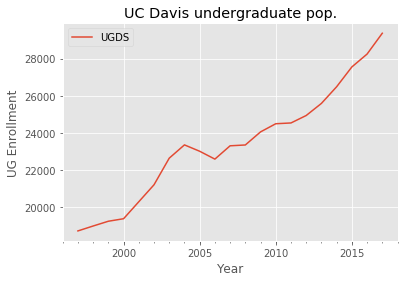
We reset the index because Plotnine does not play nicely with plotting on indices (as of the most recent release). Using Matplotlib we can plot the Davis undergraduate enrollment (UGDS) over time.
ax = davis.plot(y='UGDS')
ax.set_title('UC Davis undergraduate pop.')
ax.set_ylabel('UG Enrollment')
plt.show()
Plotnine also has trouble dealing with Period data, so let’s convert it to a timestamp.
davis['YearDT'] = davis.index.to_timestamp()
We initialize the ggplot with p9.ggplot specifying the data and the
aesthetic elements. Finally, we add a single layer of a line geom.
p9.ggplot(davis,p9.aes(x='YearDT',y='UGDS')) \
+ p9.geom_line() # first layer
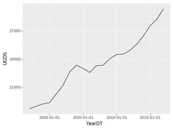
<ggplot: (8738148569699)>
We want to plot similar lines for other universities, so let’s apply the same transformations to the dataset.
col_large = col_large.reset_index(level=1)
col_large['YearDT'] = pd.PeriodIndex(col_large['Year']).to_timestamp()
col_large.info()
<class 'pandas.core.frame.DataFrame'>
Int64Index: 48362 entries, 100636 to 489201
Data columns (total 21 columns):
Year               48362 non-null object
OPEID              48362 non-null object
OPEID6             48362 non-null float64
INSTNM             48362 non-null object
CITY               48362 non-null object
STABBR             48362 non-null object
ZIP                48362 non-null object
MAIN               48362 non-null float64
NUMBRANCH          48362 non-null float64
PREDDEG            48362 non-null float64
HIGHDEG            48362 non-null float64
CONTROL            48362 non-null float64
ST_FIPS            48362 non-null float64
REGION             48362 non-null float64
ADM_RATE           21041 non-null float64
UGDS               48362 non-null float64
TUITIONFEE_IN      37823 non-null float64
TUITIONFEE_OUT     37825 non-null float64
MN_EARN_WNE_P10    12528 non-null float64
ICLEVEL            48362 non-null float64
YearDT             48362 non-null datetime64[ns]
dtypes: datetime64[ns](1), float64(14), object(6)
memory usage: 8.1+ MB
We can see some basic statistics for UC Davis in 2013 for example in the following line:
## I looked for the following variable names
## in the data dictionary on data.gov
y = '2013'
print("""
UC Davis Statistics {}
Admissions rate:{}, Undergrad admissions:{:.0f},
In-state tuition: {:.0f}, Out-of-state tuition: {:.0f},
Mean earnings 10 yrs after enroll: {:.0f}
      """.format(y,*tuple(davis.loc[y,['ADM_RATE','UGDS','TUITIONFEE_IN',
                                     'TUITIONFEE_OUT','MN_EARN_WNE_P10']])))
UC Davis Statistics 2013
Admissions rate:0.4826, Undergrad admissions:25588,
In-state tuition: 13877, Out-of-state tuition: 36755,
Mean earnings 10 yrs after enroll: 66000
The rise in tuition
Tuitions have been dramatically rising for US universities for decades. I would like to investigate where UC Davis stands in terms of this rise, and consider the differences between States. Let’s begin by examining the amount of data and missingness for these variables.
col_large.count()
Year               48362
OPEID              48362
OPEID6             48362
INSTNM             48362
CITY               48362
STABBR             48362
ZIP                48362
MAIN               48362
NUMBRANCH          48362
PREDDEG            48362
HIGHDEG            48362
CONTROL            48362
ST_FIPS            48362
REGION             48362
ADM_RATE           21041
UGDS               48362
TUITIONFEE_IN      37823
TUITIONFEE_OUT     37825
MN_EARN_WNE_P10    12528
ICLEVEL            48362
YearDT             48362
dtype: int64
It seems that ADM_RATE is about half missing and the tuition variables are around a quarter missing. After examining the dataset, it seems that most of the missingness is either due to some schools having very few non-missing entries or certain years being completely missing. We will select only the schools with mostly non-missing tuitions. We will also sample the schools so that we are not plotting the full dataset, which is too cumbersome for matplotlib.
dav_id = davis.loc['1997','UNITID'] # store davis id
col_gby = col_large.groupby(level=0) # Group by the university ID
enough_dat = col_gby.count()['TUITIONFEE_IN'] > 15 # Select those with more than 15 non-missing entries
p = .1 # select a sampling probability
in_sample = pd.Series(np.random.binomial(1,p,size=enough_dat.shape[0]) > 0,
                     index=enough_dat.index.values) #
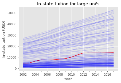
The following function will plot either the In-state or out-of-state tuition. This type of def is fine in a jupyter notebook since there is an implied flow of the data, but it uses global variables and should not be used in a module.
def tuitplot(tuitvar='TUITIONFEE_IN',tuittitle='',varlab='In-state tuition (USD)'):
    """plot the tuitvar"""
    ax = plt.subplot() # init plot
    for inst_id, df in col_gby: # iterate over unis
        df = df.reset_index()
        if inst_id == dav_id: # if davis
            df.plot(x='Year',y=tuitvar,color='r',ax=ax,legend=False) # plot red
        elif enough_dat[inst_id] and in_sample[inst_id]: # if in sample
            df.plot(x='Year',y=tuitvar,alpha=.1,color='b',ax=ax,legend=False) # plot blue
    ax.set_title(tuittitle)
    ax.set_ylabel(varlab)
    plt.show()
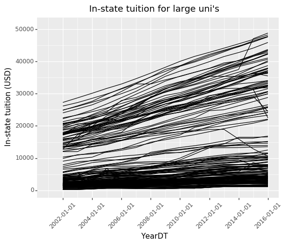
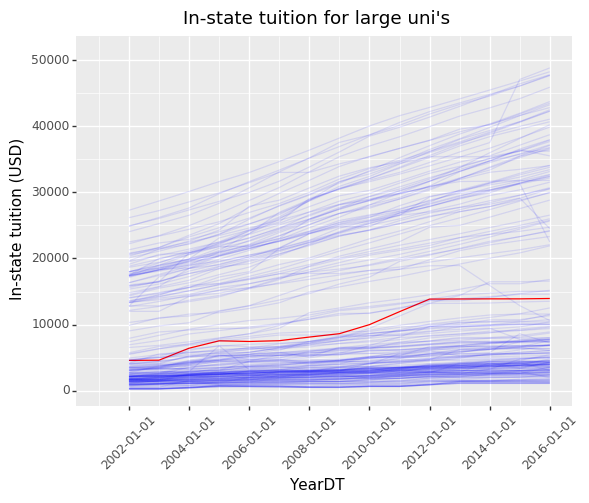
tuitplot(tuittitle = "In-state tuition for large uni's")
Plotting the full dataset is not feasible since the data is so large. Alternatively, let’s sample the dataset randomly. We will also select those universities that have enough tuition data to plot the tuition curve.
def samp_with_dav(col_large,p=.1):
    col_gby = col_large.groupby(level=0)
    enough_dat = col_gby.count()['TUITIONFEE_IN'] > 15
    in_sample = pd.Series(np.random.binomial(1,p,size=enough_dat.shape[0]) > 0,
                     index=enough_dat.index.values)
    in_sample.index.name = 'UNITID'
    col_samp = col_large[in_sample & enough_dat]
    col_dav = col_large.loc[dav_id].reset_index()
    col_dav['UNITID'] = dav_id
    col_dav = col_dav.set_index('UNITID')
    return pd.concat([col_samp,col_dav])
Let’s use this def to sample our large dataset.
col_samp = samp_with_dav(col_large)
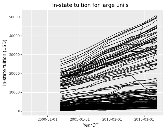
Plotnine allows us to define the individual elements of a plot. This starts with a data and the aesthetic elements, such as the X-axis, Y-axis, and grouping variables. The following adds a line geom layer. The grouping tells Plotnine that the lines should be plotted for each university separately.
p9.ggplot(col_samp.reset_index()) \
+ p9.aes('YearDT','TUITIONFEE_IN',group='UNITID') \
+ p9.geom_line() \
+ p9.labels.ggtitle("In-state tuition for large uni's") \
+ p9.labels.ylab('In-state tuition (USD)')
<ggplot: (8738146170828)>
In the above plot we added some annotations, such as the y-label. We can
further modify the annotations by rotating the X-axis text (we do this
with p9.theme()) and setting the X limits.
p9.ggplot(col_samp.reset_index()) \
+ p9.aes('YearDT','TUITIONFEE_IN',group='UNITID') \
+ p9.geom_line() \
+ p9.theme(axis_text_x = p9.themes.element_text(rotation=45)) \
+ p9.labels.ggtitle("In-state tuition for large uni's") \
+ p9.labels.ylab('In-state tuition (USD)') \
+ p9.scale_x_date(limits=['2001','2016'])
<ggplot: (-9223363298714606094)>
We can add color by including another aesthetic element, the color and
alpha to be expressions involving the UNITID. This will make UC Davis
show up in red. The color and alpha are given scales, using
p9.scale_alpha_identity() and p9.scale_color_cmap() where the
cmap is the first argument. It determines the scale for the color,
meaning how do we translate the number .5 into a color. All
Matplotlib colormaps are available for use in Plotnine:
https://matplotlib.org/users/colormaps.html
p9.ggplot(col_samp.reset_index()) \
+ p9.aes('YearDT','TUITIONFEE_IN',group='UNITID',
         alpha='.1+.9*(UNITID=={})'.format(dav_id),
         color='1.*(UNITID=={})'.format(dav_id)) \
+ p9.scale_alpha_identity() \
+ p9.scale_color_cmap('bwr',guide=False) \
+ p9.geom_line() + p9.scale_x_date(limits=['2001','2016']) \
+ p9.theme(axis_text_x = p9.themes.element_text(rotation=45)) \
+ p9.labels.ggtitle("In-state tuition for large uni's") \
+ p9.labels.ylab('In-state tuition (USD)')
<ggplot: (-9223363298706272210)>
We can replicate the same plots but for out-of-state tuition. Out-of-state is much larger and seems to be at higher quantiles than in-state tuition.
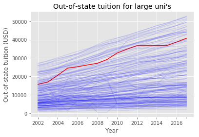
tuitplot('TUITIONFEE_OUT',"Out-of-state tuition for large uni's",
         'Out-of-state tuition (USD)')
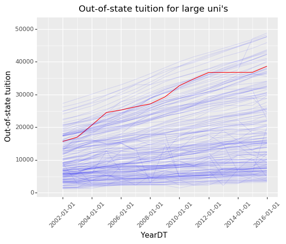
p9.ggplot(col_samp.reset_index()) \
+ p9.aes('YearDT','TUITIONFEE_OUT',group='UNITID',
         alpha='.1+.9*(UNITID=={})'.format(dav_id),
         color='1.*(UNITID=={})'.format(dav_id)) \
+ p9.scale_alpha_identity() \
+ p9.scale_color_cmap('bwr',guide=False) \
+ p9.geom_line() + p9.scale_x_date(limits=['2001','2016']) \
+ p9.theme(axis_text_x = p9.themes.element_text(rotation=45)) \
+ p9.labels.ggtitle("Out-of-state tuition for large uni's") \
+ p9.labels.ylab('Out-of-state tuition')
<ggplot: (8738139995221)>
We can also pivot on the State, which means that we will produce a plot for every state. This will create many plots, so we adopt a minimalist theme (called void) and shrink the size of each plot.
p9.ggplot(col_samp.reset_index()) \
+ p9.aes('YearDT','TUITIONFEE_OUT',group='UNITID',
         alpha='.1+.9*(UNITID=={})'.format(dav_id),
         color='1.*(UNITID=={})'.format(dav_id)) \
+ p9.scale_alpha_identity() \
+ p9.scale_color_cmap('bwr',guide=False) \
+ p9.geom_line() + p9.scale_x_date(limits=['2001','2016']) \
+ p9.theme_void() \
+ p9.facet_wrap('~ STABBR',ncol=8) \
+ p9.labels.ggtitle("Out-of-state tuition for large uni's") \
+ p9.labels.ylab('Out-of-state tuition')
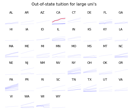
<ggplot: (8738140203349)>
We can also only plot trend lines for each state. This produces an
interesting plot that lets us quickly compare the OLS fit to each state.
Because there is not issue with plotting too many geoms in this case, we
can fit it on the entire data (we use col_large).
p9.ggplot(col_large.reset_index()) \
+ p9.aes('YearDT','TUITIONFEE_OUT',group='STABBR') \
+ p9.scale_x_date(limits=['2001','2016']) \
+ p9.facet_wrap('~ STABBR',ncol=8) \
+ p9.stat_smooth(method='lm') \
+ p9.theme_void() \
+ p9.labels.ggtitle("Out-of-state tuition for large uni's by state") \
+ p9.labels.ylab('Out-of-state tuition')
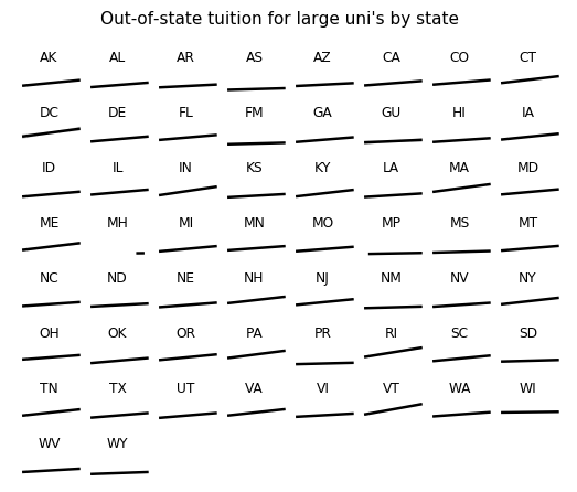
<ggplot: (8738139232390)>
There are a few interesting take-aways from these plots. First, the bulk of large universities have tuitions below 10,000 USD. The increase of the tuition seems to be more severe for more expensive universities than for less expensive ones. The increase in tuition in the US is also more extreme in certain states, particularly PA, NY, and MA.
Earnings trends
The college Scorecard also reports the mean earnings of students working and not enrolled 10 years after entry, which is encoded in the MN_EARN_WNE_P10 variable. We will draw a scatterplot of this variable against the in-state tuition for each university. We will add the undergraduate enrollment (UGDS) as a color and size aesthetic element. Then we specify the scale for the size and the color. We make it a scatterplot by adding point geoms. This is done on data for 2013.
col_2013 = col_large.query('YearDT == "2013-01-01"')
p9.ggplot(col_2013) + p9.aes('TUITIONFEE_IN','MN_EARN_WNE_P10',size='UGDS',color='UGDS')\
+ p9.scale_size_area(breaks=[10000,20000,40000]) \
+ p9.labels.ggtitle("Mean earnings as a function of in-state tuition") \
+ p9.geom_point(alpha=.5) + p9.scale_color_cmap('plasma',guide=False)
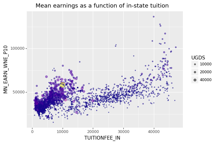
<ggplot: (-9223363298706237117)>
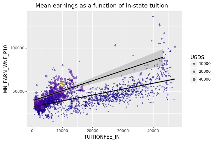
We can also add linear regression lines to the plot. By specifying groups to be universities above and below 20,000 undergrad students we see that larger universities tend to have a higher trend line.
p9.ggplot(col_2013) + p9.aes('TUITIONFEE_IN','MN_EARN_WNE_P10',size='UGDS',
                             color='UGDS',groups='UGDS > 20000')\
+ p9.scale_size_area(breaks=[10000,20000,40000]) \
+ p9.labels.ggtitle("Mean earnings as a function of in-state tuition") \
+ p9.geom_point(alpha=.5) + p9.stat_smooth(show_legend=False) + p9.scale_color_cmap('plasma',guide=False)
<ggplot: (-9223363298706232127)>
In the above plot the scatter points are sized such that the area is proportional to the undergraduate enrollment for the university. Just from observation, it seems there are two populations (likely between public and private universities) such that the mean earnings as a function of tuition is higher in the left population and on the right population has a smaller trend but some of the universities have significantly higher mean earnings.
Other comparisons
In this section we will look at other variables, such as admittance rate and the highest degree that the institution grants. Let’s focus on the 2013 data that has the in-state tuition not missing.
col_2013_nna = col_2013[~col_2013['TUITIONFEE_IN'].isna()]
col_2013_nna = col_2013_nna[col_2013_nna['HIGHDEG'] != 0]
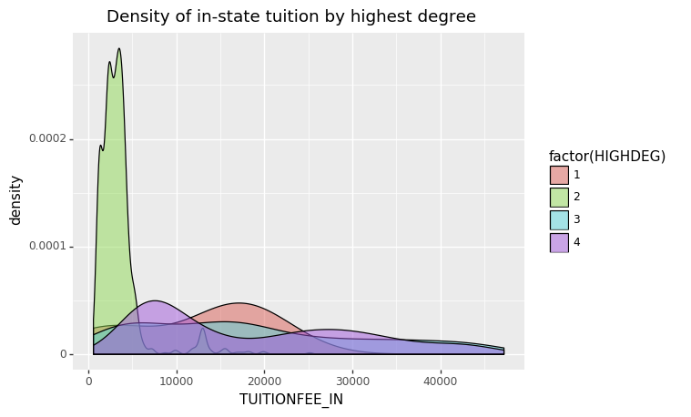
We will begin by considering the highest degree granted (HIGHDEG) and in-state tuition. Because HIGHDEG is categorical, it is natural to either facet on it or to make it an aesthetic element for a univariate plot such as a density estimate. We will go with having it determine the fill color for density estimates of the tuition.
p9.ggplot(col_2013_nna) + p9.aes('TUITIONFEE_IN',fill='factor(HIGHDEG)') \
+ p9.geom_density(alpha=.5) + p9.labels.ggtitle('Density of in-state tuition by highest degree')
<ggplot: (-9223363298708625555)>
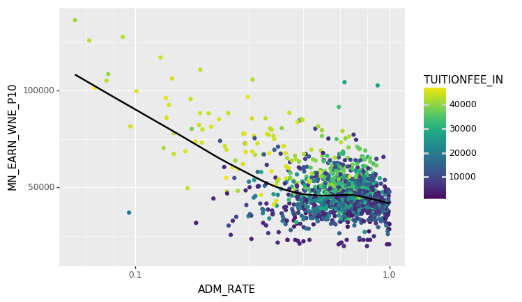
We can also get a sense of the influence of admissions rate (ADM_RATE) on the mean earnings. We will use a point geom to get a scatterplot. We will also add a lowess smoother layer to get a sense of the trend. Because ADM_RATE is concentrated around 1 it makes sense to use a log-scale for the x axis. This does not change the axis text but does change the position of the point geoms. We also add a color aesthetic element for in-state tuition.
p9.ggplot(col_2013_nna) + p9.aes('ADM_RATE','MN_EARN_WNE_P10',color='TUITIONFEE_IN') \
+ p9.geom_point() + p9.scale_x_log10() \
+ p9.scale_color_cmap() + p9.stat_smooth(method='lowess')
<ggplot: (8738146242017)>
This indicates that there is a close relationship between admissions rate, tuition, and mean earnings. From the generally positive trend of earnings as a function of tuition we may conclude that atttending a more expensive university will cause someone to earn more, but we need to consider confounding variables such as admission rate. These visualizations can help us understand the complex dependencies in this data.
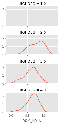
We can also look at the admissions rates as a function of the highest
degree granted. For this we use the Seaborn package, which has a larger
selection of named plots than Pyplot. For example the sns.Facetgrid
will facet on one or two variables and make a grid of plots, in this
case we plot the density of the admission rate.
import seaborn as sns
g = sns.FacetGrid(col_2013_nna,row='HIGHDEG',aspect=2, height=1.5)
sfig = g.map(sns.kdeplot,'ADM_RATE')
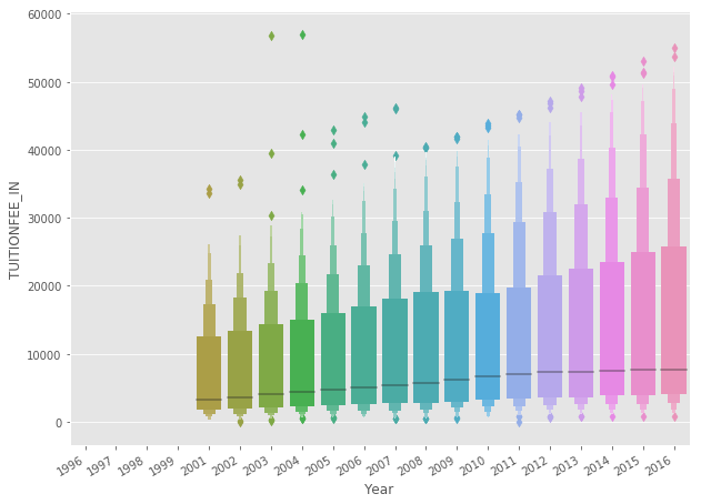
Another interesting named plot is the boxenplot that will produce vertical histograms of the Y variable with variable bin widths by grouping on the X variable. The following is another look at the in-state tuition by year.
g = sns.boxenplot(x='Year',y='TUITIONFEE_IN',data=col_large)
g.format_xdata = mpl.dates.DateFormatter('%Y-%m-%d')
g.figure.autofmt_xdate()
You can find many more examples of named plots at the Seaborn website: https://seaborn.pydata.org/
Note: Plotnine is a good example of a Python package. It is well organized and has extensive documentation. If you look at the Plotnine source code you can see the basic organization of the sub-modules. Because they have great docstrings, you can for example use help to see what the following method does.
help(p9.themes.element_text)
Help on class element_text in module plotnine.themes.elements: class element_text(builtins.object) | element_text(family=None, style=None, weight=None, color=None, size=None, ha=None, va=None, rotation=None, linespacing=None, backgroundcolor=None, margin=None, **kwargs) | | Theme element: Text | | Parameters | ---------- | family : str | Font family | style : 'normal' | 'italic' | 'oblique' | Font style | color : str | tuple | Text color | weight : str | Should be one of normal, bold, heavy, light, | ultrabold or ultralight. | size : float | text size | ha : 'center' | 'left' | 'right' | Horizontal Alignment. | va : 'center' | 'top' | 'bottom' | 'baseline' | Vertical alignment. | rotation : float | Rotation angle in the range [0, 360] | linespacing : float | Line spacing | backgroundcolor : str | tuple | Background color | margin : dict | Margin around the text. The keys are one of |['t', 'b', 'l', 'r']andunits. The units are | one of['pt', 'lines', 'in']. The units default | toptand the other keys to0. Not all text | themeables support margin parameters and other than the |units, only some of the other keys will a. | kwargs : dict | Parameters recognised bymatplotlib.text.Text| | Note | ---- |element_textwill accept parameters that conform to the | ggplot2 element_text API, but it is preferable the | Matplotlib based API described above. | | Methods defined here: | | __init__(self, family=None, style=None, weight=None, color=None, size=None, ha=None, va=None, rotation=None, linespacing=None, backgroundcolor=None, margin=None, **kwargs) | Initialize self. See help(type(self)) for accurate signature. | | ---------------------------------------------------------------------- | Data descriptors defined here: | | __dict__ | dictionary for instance variables (if defined) | | __weakref__ | list of weak references to the object (if defined)